CSS Properties
Have you ever wondered how websites transform from plain text to visually appealing and interactive pages? The secret lies in CSS properties! Cascading Style Sheets (CSS) allow you to control the appearance of HTML elements on your web pages. In this tutorial, we’ll take you on a journey through the world of CSS properties, explaining their functionalities, providing code examples, and sharing practical tips along the way.
Table of Contents
Introduction to CSS Properties
CSS properties are the building blocks of styling web pages. They allow you to control various aspects of an element’s appearance, such as colors, fonts, sizes, positions, and animations. By applying CSS properties, you can transform a simple HTML document into a visually captivating and engaging web page.
Let’s dive into the world of CSS properties and explore the most popular ones!
Text and Font Properties
font-family
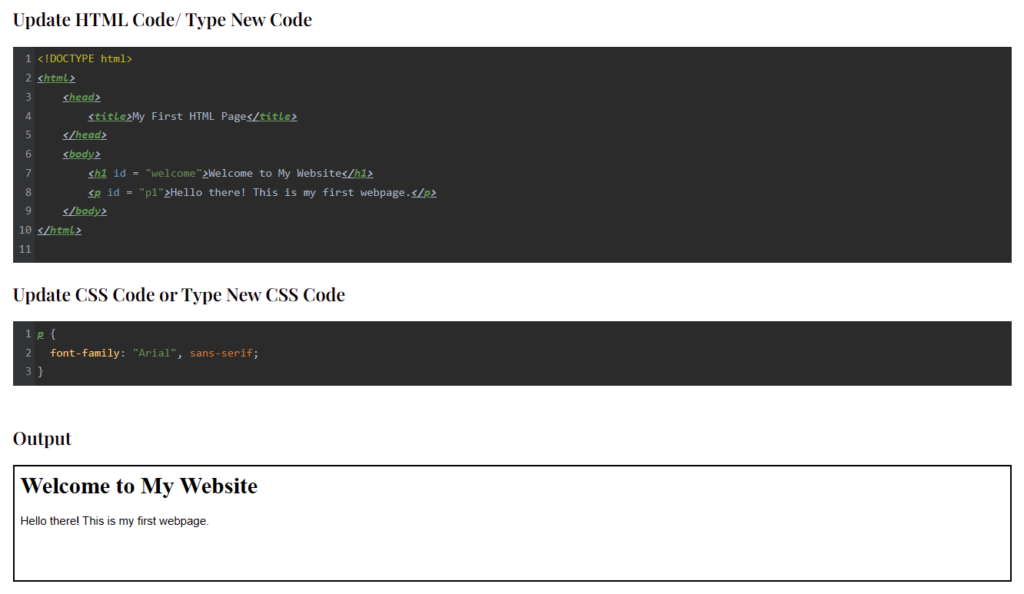
The font-family property defines the typeface or font
family to be used for text within an element. You can specify multiple fonts in order of preference, ensuring that if the browser doesn’t support the first font, it will try the next one.
p {
  font-family: "Arial", sans-serif;
}Output
If you run the above code online Clicking the “Run this Code Online” button, you will see how the above CSS code is styling above HTML.
font-size
The font-size property sets the size of the text within an element. You can specify it in pixels, percentages, ems, or other units.
h1 {
  font-size: 24px;
}color
The color property determines the text color within an element. You can specify it using named colors, hexadecimal values, RGB, or HSL values.
p {
  color: #FF0000;
}text-align
The text-align property aligns the text within an element horizontally. You can set it to values like left, right, center, or justify.
div {
  text-align: center;
}text-decoration
The text-decoration property adds decorative styling to text, such as underlines, overlines, or strikethroughs.
a {
  text-decoration: none;
}Box Model Properties
margin
The margin property sets the space outside an element. It defines the gap between an element and its neighboring elements.
div {
  margin: 10px;
}padding
The padding property sets the space between the content of an element and its border.
p {
  padding: 20px;
}border
The border property specifies the width, style, and color of an element’s border.
div {
  border: 1px solid #000000;
}width
The width property sets the width of an element.
img {
  width: 100%;
}height
The height property sets the height of an element.
div {
  height: 200px;
}Background and Display Properties
background-color
The background-color property sets the background color of an element.
body {
  background-color: #FFFFFF;
}background-image
The background-image property sets an image as the background of an element.
div {
  background-image: url("background.jpg");
}display
The display property defines how an element is displayed on the page. It can change an element’s behavior from a block-level element to an inline element, or vice versa.
span {
  display: inline-block;
}overflow
The overflow property controls what happens when content overflows an element’s box.
div {
  overflow: hidden;
}box-shadow
The box-shadow property adds a shadow effect to an element. You can control the shadow’s color, blur radius, and position.
div {
  box-shadow: 2px 2px 4px rgba(0, 0, 0, 0.5);
}Positioning and Layout Properties
position
The position property specifies the positioning method used for an element. It can be set to static, relative, absolute, or fixed.
div {
  position: absolute;
  top: 50px;
  left: 100px;
}top, right, bottom, left
The top, right, bottom, and left properties define the positioning offsets
for an element with a positioned value.
div {
  position: relative;
  top: 10px;
  left: 20px;
}float
The float property allows an element to float to the left or right of its container. It is commonly used for creating multicolumn layouts.
img {
  float: right;
}clear
The clear property specifies which sides of an element are not allowed to be adjacent to floating elements.
div {
  clear: both;
}z-index
The z-index property controls the stacking order of elements on the z-axis. It determines which elements appear in front of others.
div {
  z-index: 1;
}Transform and Transition Properties
transform
The transform property applies transformations to an element, such as scaling, rotating, skewing, or translating.
img {
  transform: rotate(45deg);
}transition
The transition property creates smooth transitions between different property values. It allows you to specify the duration, timing function, and delay.
button {
  transition: background-color 0.3s ease-in-out;
}animation
The animation property lets you create animations on an element. It combines multiple keyframes and specifies the duration, timing function, delay, and iteration count.
div {
  animation: myAnimation 3s ease-in-out infinite;
}perspective
The perspective property adds a 3D perspective to an element and its children. It affects the appearance of 3D-transformed elements.
div {
  perspective: 500px;
}backface-visibility
The backface-visibility property defines whether the back face of a 3D-transformed element is visible or hidden.
div {
  backface-visibility: hidden;
}Flexbox and Grid Properties
flex
The flex property specifies how flex items expand or shrink to fit the available space along the main axis. It combines flex-grow, flex-shrink, and flex-basis.
div {
  flex: 1 0 auto;
}justify-content
The justify-content property aligns flex items along the main axis. It determines how extra space is distributed between and around the items.
.container {
  justify-content: center;
}align-items
The align-items property aligns flex items along the cross axis. It controls how items are positioned vertically within a flex container.
.container {
  align-items: flex-end;
}grid-template-columns
The grid-template-columns property defines the number and size of columns in a grid container.
.grid-container {
  display: grid;
  grid-template-columns: 1fr 2fr 1fr;
}grid-gap
The grid-gap property sets the size of the gap between rows and columns in a grid container.
.grid-container {
  display: grid;
  grid-gap: 10px;
}
CSS Variables
CSS variables, also known as custom properties, allow you to define reusable values that can be used throughout your CSS. They provide a convenient way to store and manage values that are used repeatedly in your stylesheets.
To define a CSS variable, use the -- prefix followed by a name and assign it a value.
:root {
  --main-color: #FF0000;
}

h1 {
  color: var(--main-color);
}Wrapping Up
Congratulations! You’ve now explored the world of CSS properties and learned how they can be used to style web pages. From text and font properties to positioning and layout, you have gained a solid understanding of the key concepts.
Remember, practice makes perfect. The more you experiment with CSS properties and combine them creatively, the more control you’ll have over the appearance and behavior of your web pages. So go ahead and unleash your creativity!
Frequently Asked Questions
Q: How do I change the font size of only one paragraph?
To change the font size of a specific paragraph, you can use the CSS id or class selectors. For example:
<p id="special-paragraph">This is a special paragraph.</p>#special-paragraph {
font-size: 18px;
}Q: Can I apply multiple CSS properties to a single element?
Absolutely! You can apply multiple CSS properties to an element by separating them with a semicolon. For example:
h1 {
  font-size: 24px;
  color: #FF0000;
  text-align: center;
}Q: How can I center an element horizontally and vertically on the page?
To center an element horizontally and vertically on the page, you can use a combination of CSS properties. Here’s an example:
div {
  position: absolute;
  top: 50%;
  left: 50%;
  transform: translate(-50%, -50%);
}Q: What is the difference between display: inline and display: block?
The display: inline property makes an element behave like an inline element, allowing other elements to appear on the same line. The display: block property, on the other hand, makes an element behave like a block-level element, taking up the full width of its parent and pushing other elements to a new line.
Q: How can I create a responsive layout using CSS properties?
To create a responsive layout, you can use CSS properties like media queries and flexbox. Media queries allow you to apply different styles based on the device’s screen size, while flexbox provides a flexible way to arrange elements within a container. By combining these techniques, you can design layouts that adapt to different screen sizes.
Q: How can I add a drop shadow effect to an element?
To add a drop shadow effect to an element, you can use the box-shadow property. Here’s an example:
div {
  box-shadow: 2px 2px 4px rgba(0, 0, 0, 0.5);
}Q: How can I create a responsive grid layout using CSS properties?
To create a responsive grid layout, you can use CSS properties like grid-template-columns, grid-template-rows, and grid-gap. These properties allow you to define the number and size of columns and rows in a grid container, as well as set the gap between them.
Q: What are CSS variables and how do I use them?
CSS variables, also known as custom properties, allow you to define reusable values that can be used throughout your CSS. To define a CSS variable, use the -- prefix followed by a name and assign it a value. You can then use the var() function to reference the variable in other CSS properties.
Q: Can I use CSS properties to create animations?
Yes, you can use CSS properties like transform, transition, and animation to create animations. The transform property allows you to apply various transformations, such as scaling, rotating, skewing, or translating an element. The transition property enables smooth transitions between different property values, and the animation property lets you create complex animations by defining keyframes.
Q: Are CSS properties supported in all browsers?
Most modern browsers support CSS properties, but it’s important to check for browser compatibility when using specific properties or features. You can use websites like Can I Use (https://caniuse.com) to check the compatibility of CSS properties across different browsers.
Related Tutorials
- Introduction to HTML Tags: Learn the basics of HTML tags and their usage.
- CSS Selectors: Understand how CSS selectors work and how to apply styles selectively.
- Responsive Web Design: Dive into the world of responsive web design and learn how to create websites that adapt to different devices.