CSS Images
Hello there, web design enthusiasts! Today, we’re going to dive into the colorful world of CSS Images. Whether you’re a seasoned developer or just starting your coding journey, this tutorial will help you understand and implement CSS Images in your projects. So, let’s get started!
Table of Contents
CSS Background Image
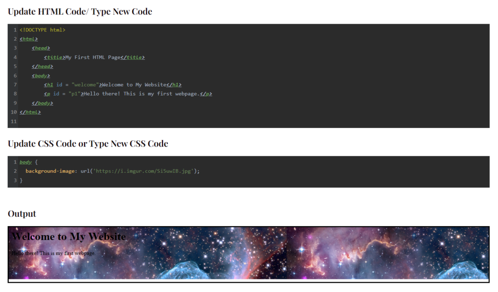
Ever wondered how to spruce up your webpage with a stunning background image? CSS has got you covered!
The background-image property in CSS allows you to set an image as the background of an element. Here’s a basic example:
body {
  background-image: url('https://www.skillseminary.com/images/sunflower.jpg');
}Output
If you run the above code online Clicking the “Run this Code Online” button, you will see how the above CSS code is styling above HTML.
But wait, there’s more! You can also adjust the size and position of your background image using the background-size and background-position properties. Let’s take a look:
body {
  background-image: url('https://www.skillseminary.com/images/sunflower.jpg');
  background-size: cover;
  background-position: center;
}In this example, background-size: cover; scales the image as large as possible without stretching it, and background-position: center; positions the image right in the center of the page. Neat, right?
CSS Image Gallery
An image gallery can make your website visually appealing and user-friendly. Let’s create a basic image gallery using CSS:
<div class="image-gallery">
  <img src="image1.jpg" alt="Image 1">
  <img src="image2.jpg" alt="Image 2">
  <img src="image3.jpg" alt="Image 3">
</div>.image-gallery img {
width: 100%;
height: auto;
}But why stop there? Let’s make our image gallery responsive and add some thumbnails:
.image-gallery img {
  width: 100%;
  height: auto;
}
@media screen and (min-width: 600px) {
.image-gallery {
display: flex;
justify-content: space-between;
}
}In this example, the @media rule makes our image gallery responsive, and the display: flex; property aligns our images in a row with equal space between them.
CSS Image Hover Effects
Hover effects can add a dynamic feel to your website. Let’s create a basic hover effect on an image:
img:hover {
  transform: scale(1.1);
}In this example, the :hover selector is used to select the image when you mouse over it, and the transform: scale(1.1); property enlarges the image.
But we can make it even cooler! Let’s add some text and transition effects:
img {
  transition: transform 0.3s ease;
}

img:hover {
  transform: scale(1.1);
}

img:hover::after {
  content: 'Hello!';
  color: white;
  position: absolute;
  top: 50%;
  left: 50%;
  transform: translate(-50%, -50%);
}In this example, the transition property adds a smooth animation to the hover effect, and the ::after pseudo-element adds text when you hover over the image.
CSS Image Slider
An image slider can make your website look professional and interactive. Here’s a basic structure of a CSS image slider:
<div class="slider">
  <img src="image1.jpg" alt="Image 1">
  <img src="image2.jpg" alt="Image 2">
  <img src="image3.jpg" alt="Image 3">
</div>.slider {
display: flex;
overflow-x: auto;
scroll-snap-type: x mandatory;
}
.slider img {
flex: none;
scroll-snap-align: start;
width: 100%;
height: auto;
}In this example, the display: flex; property aligns our images in a row, and the scroll-snap-type: x mandatory; property enables horizontal scrolling.
But let’s take it up a notch! Let’s add some thumbnails and autoplay:
<div class="slider" id="slider">
  <img src="image1.jpg" alt="Image 1">
  <img src="image2.jpg" alt="Image 2">
  <img src="image3.jpg" alt="Image 3">
</div>

<div class="thumbnails">
  <img src="image1.jpg" alt="Image 1" onclick="currentSlide(1)">
  <img src="image2.jpg" alt="Image 2" onclick="currentSlide(2)">
  <img src="image3.jpg" alt="Image 3" onclick="currentSlide(3)">
</div>var slideIndex = 0;
showSlides();
function showSlides() {
var i;
var slides = document.getElementsByClassName("slider");
for (i = 0; i < slides.length; i++) {
slides[i].style.display = "none";
}
slideIndex++;
if (slideIndex > slides.length) {slideIndex = 1}
slides[slideIndex-1].style.display = "block";
setTimeout(showSlides, 2000); // Change image every 2 seconds
}
function currentSlide(n) {
showSlides(slideIndex = n);
}
In this example, the onclick attribute calls a function to display the current slide, and the setTimeout method changes the image every 2 seconds, creating an autoplay effect.
CSS Image Grid
An image grid can organize your images in a neat and orderly fashion. Here’s a basic structure of a CSS image grid:
<div class="image-grid">
  <img src="https://www.skillseminary.com/images/sunflower2.jpg" alt="Image 1">
  <img src="https://www.skillseminary.com/images/daisy-flower2.jpg" alt="Image 2">
  <img src="https://www.skillseminary.com/images/sunset2.jpg" alt="Image 3">
</div>.image-grid {
display: grid;
grid-template-columns: repeat(auto-fill, minmax(200px, 1fr));
grid-gap: 10px;
}In this example, the display: grid; property creates a grid layout, and the grid-template-columns: repeat(auto-fill, minmax(200px, 1fr)); property creates responsive columns for our images.
But let’s make it even better! Let’s add some captions:
<div class="image-grid">
  <figure>
    <img src="https://www.skillseminary.com/images/sunflower2.jpg" alt="Image 1">
    <figcaption>Caption for image 1</figcaption>
  </figure>
  <figure>
    <img src="https://www.skillseminary.com/images/daisy-flower2.jpg" alt="Image 2">
    <figcaption>Caption for image 2</figcaption>
  </figure>
  <figure>
    <img src="https://www.skillseminary.com/images/sunset2.jpg" alt="Image 3">
    <figcaption>Caption for image 3</figcaption>
  </figure>
</div>
In this example, the <figure> and <figcaption> elements are used to add captions to our images.
Wrapping Up
And that’s a wrap! We’ve covered how to use CSS to
create background images, image galleries, hover effects, image sliders, and image grids. With these tools in your toolkit, you’re well on your way to creating stunning web designs!
Frequently Asked Questions
How do I set a background image in CSS?
You can set a background image in CSS using the background-image property.
How do I create a responsive image gallery in CSS?
You can create a responsive image gallery in CSS using the display: flex; property and media queries.
How do I create hover effects in CSS?
You can create hover effects in CSS using the :hover selector and the transform property.
How do I create an image slider in CSS?
You can create an image slider in CSS using the display: flex; property and the scroll-snap-type property.
How do I create an image grid in CSS?
You can create an image grid in CSS using the display: grid; property and the grid-template-columns property.
How do I adjust the size of a background image in CSS?
You can adjust the size of a background image in CSS using the background-size property.
How do I add text to a hover effect in CSS?
You can add text to a hover effect in CSS using the ::after pseudo-element and the content property.
How do I add thumbnails to an image slider in CSS?
You can add thumbnails to an image slider in CSS using the onclick attribute and a JavaScript function.
How do I add captions to an image grid in CSS?
You can add captions to an image grid in CSS using the <figure> and <figcaption> elements.
How do I make an image slider autoplay in CSS?
You can make an image slider autoplay in CSS using the setTimeout method in JavaScript.
Related Tutorials
- Mastering CSS Flexbox
- Creating Interactive Websites with CSS Animations
- Designing Responsive Websites with CSS Grid
I hope you found this tutorial helpful! Remember, practice makes perfect. So, don’t hesitate to get your hands dirty and start coding! Happy designing!